More than 400 exhibitors showcased flooring, tile, rugs, furniture, lighting fixtures, decorative accents, and more at the Architectural Digest Design Show this past weekend. We had a chance to walk the show floor and catch a glimpse at some of the latest trends in the design world. Here’s a glimpse of what we saw.
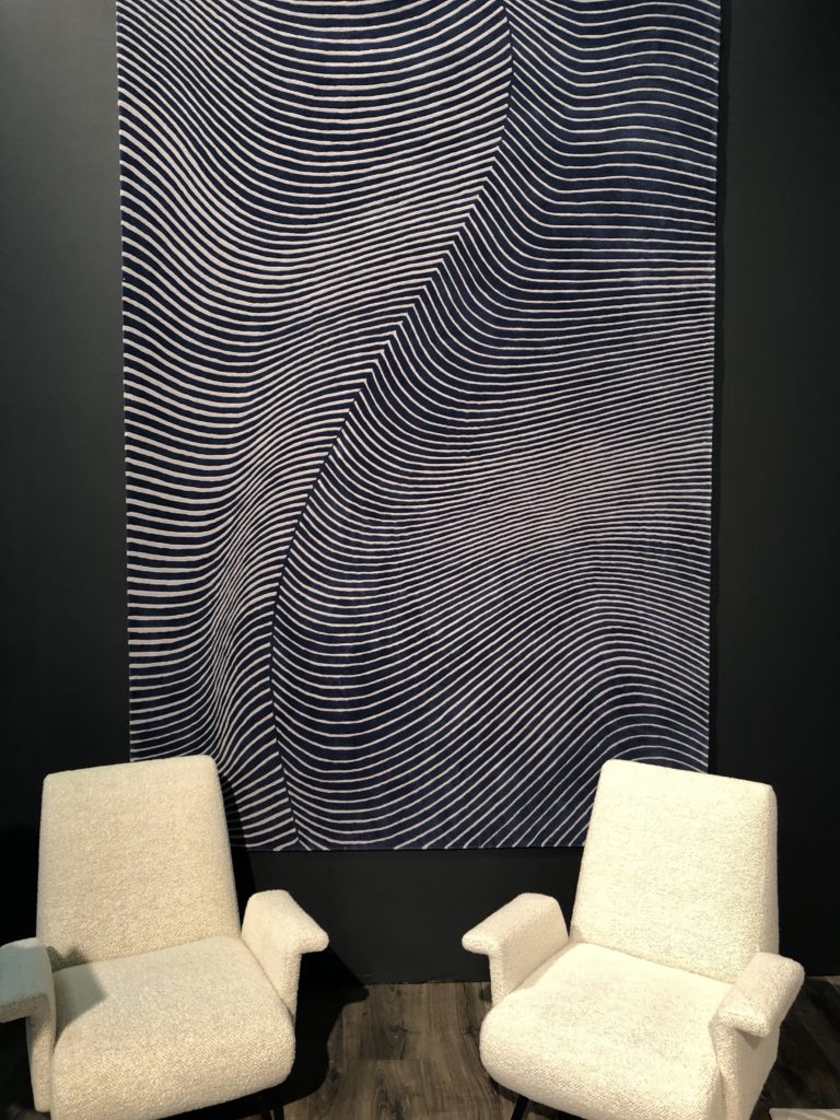
Moody Hues
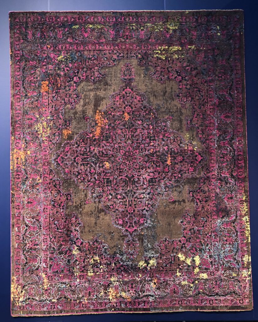
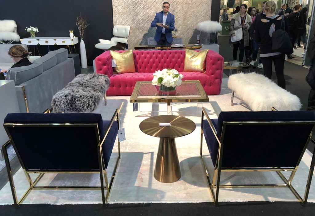
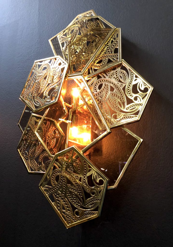
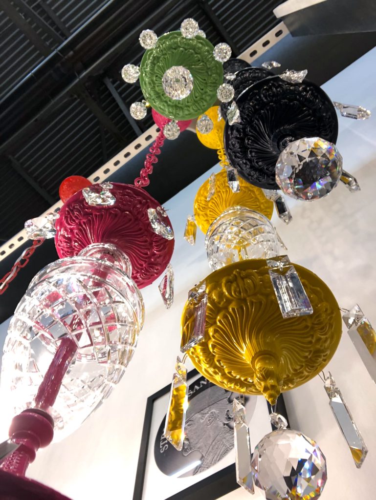
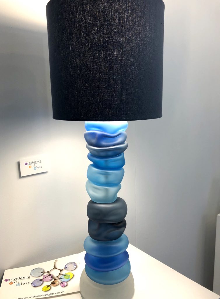
If I had to sum up what I saw at the show in one word, it would be drama. And nothing was so dramatic as the rich, deep, jewel-toned colors seen in so many booths. Sapphire blues, plummy purples, forest greens, and berry pinks were used as both focal and accent colors in walls, furniture, rugs, and accessories. Complementing these rich, moody tones were dramatic, eye-catching accents, like metallic fixtures and Art Deco-inspired accessories.
Best Brands of 2024
High Performance Flooring
Brilliant Floors, Intelligently Priced Order Samples
Ultimate Destination For Luxury Flooring Order Samples
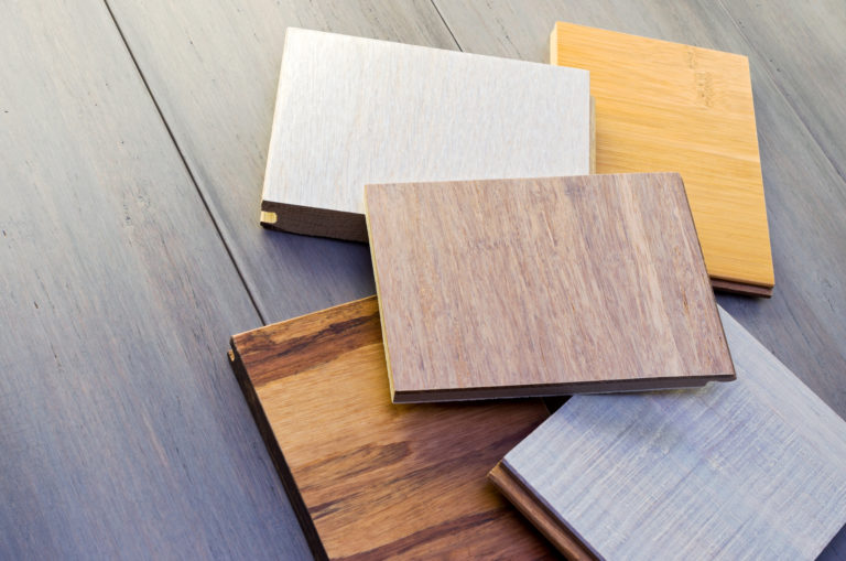
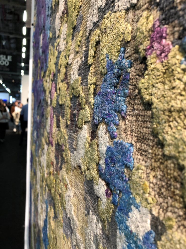
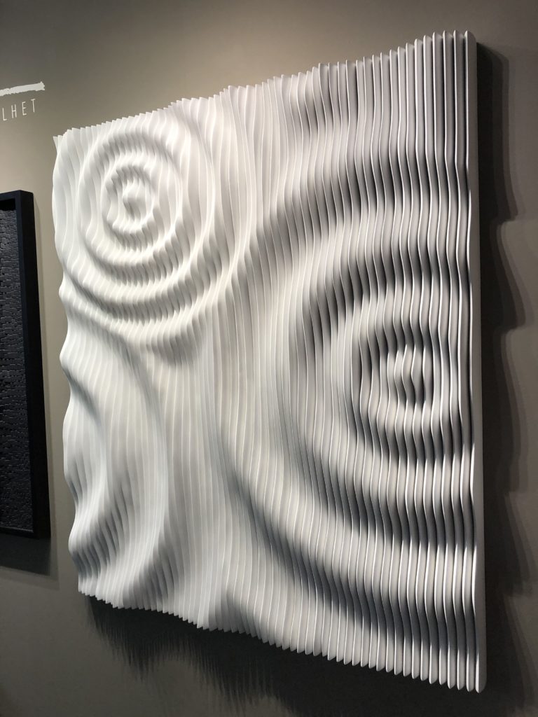
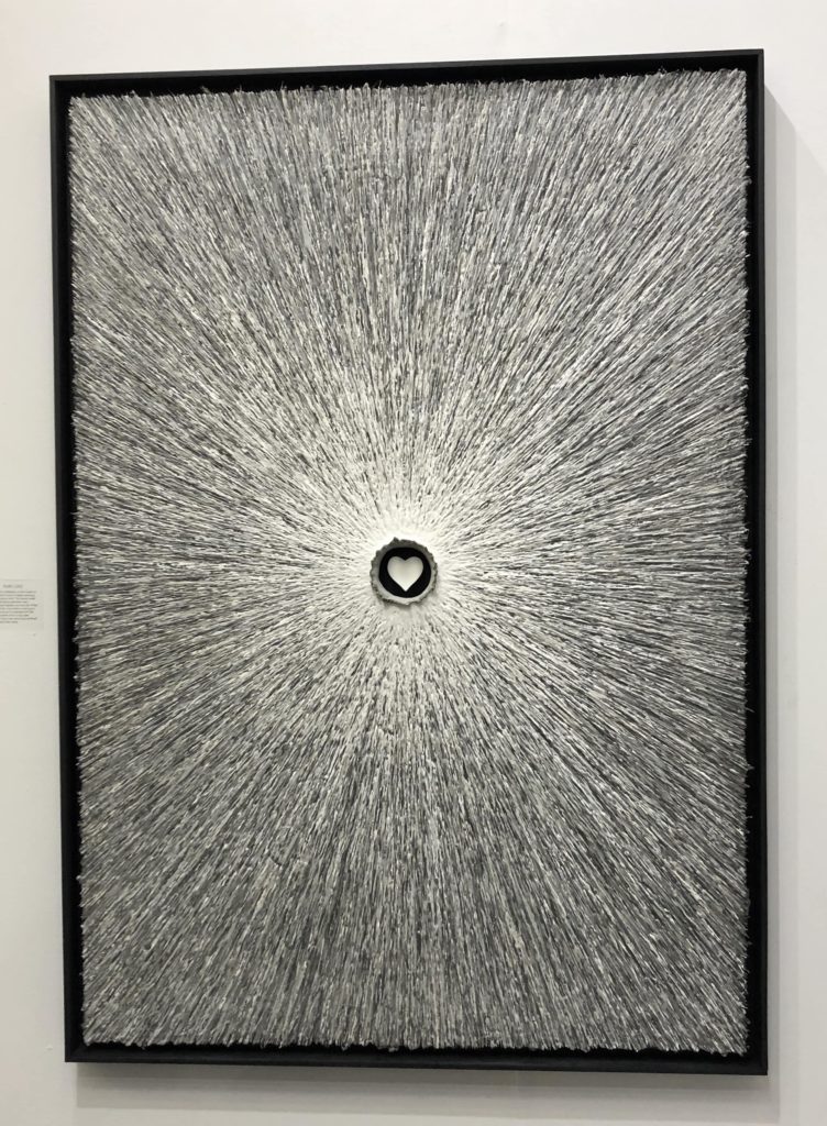
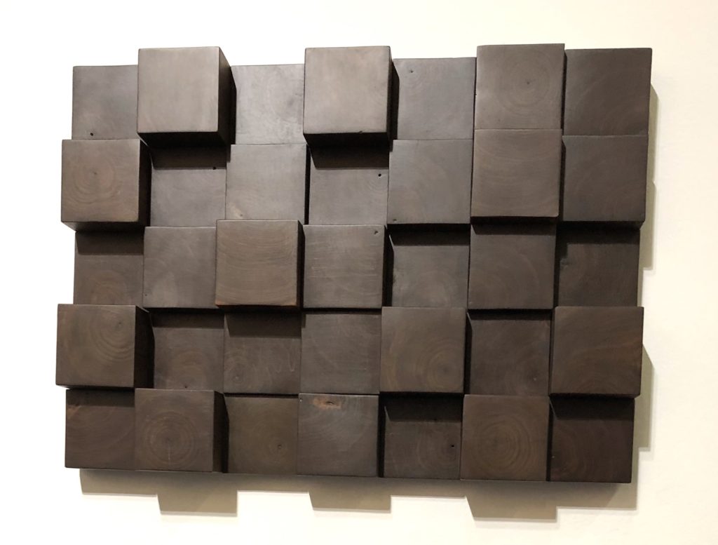
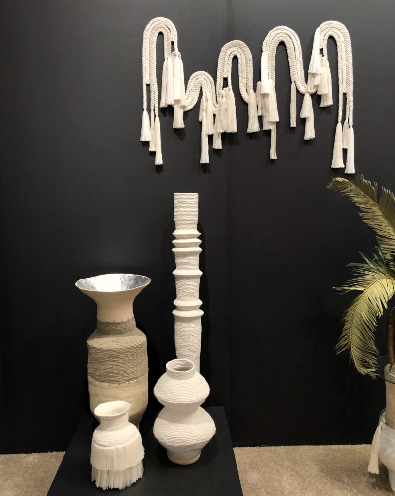
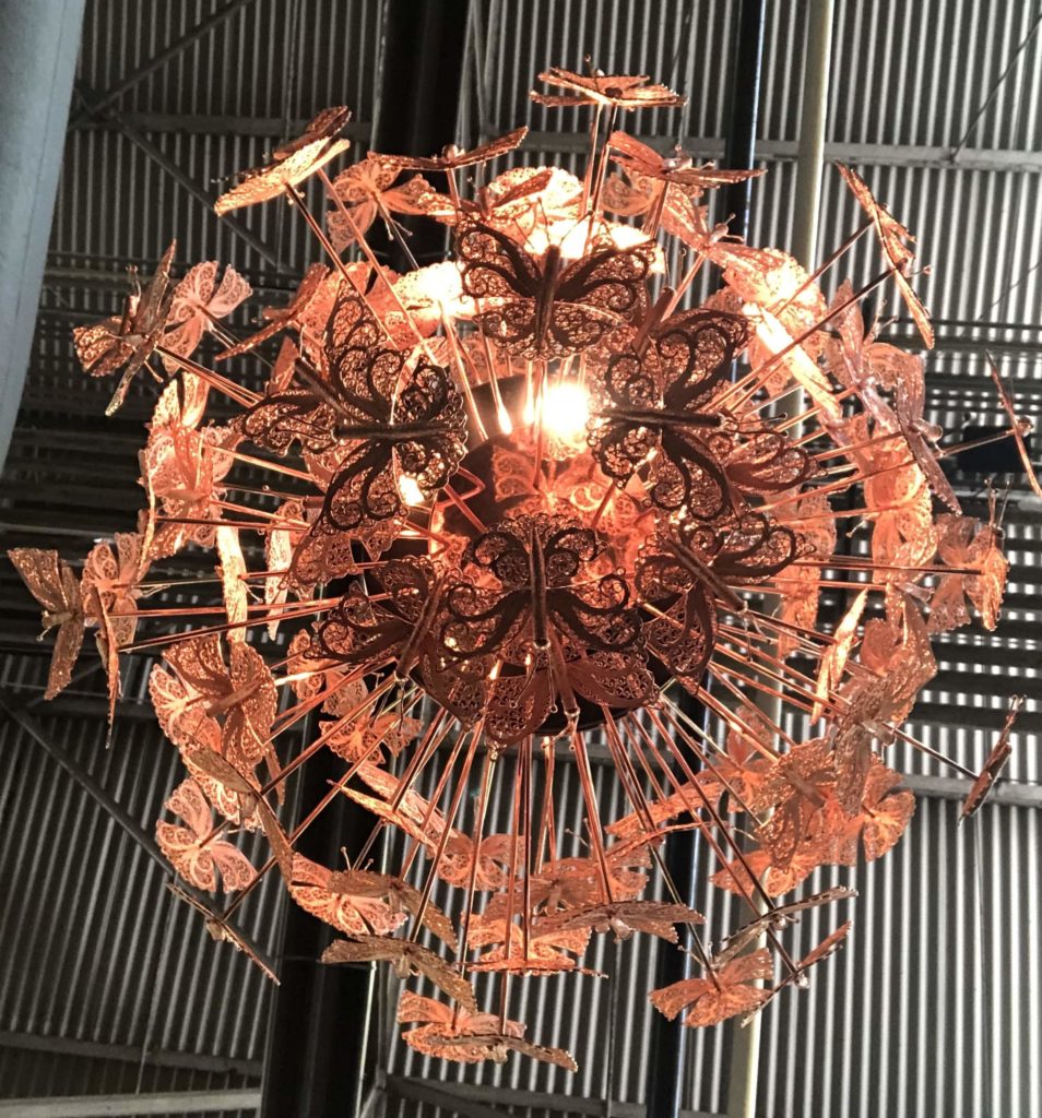
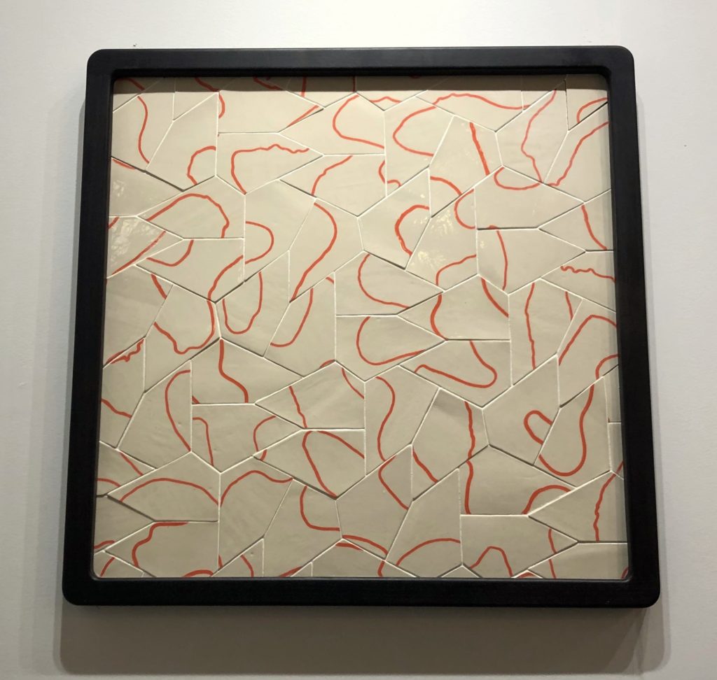
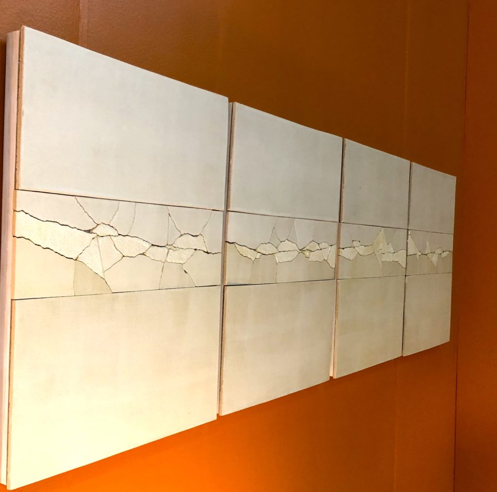
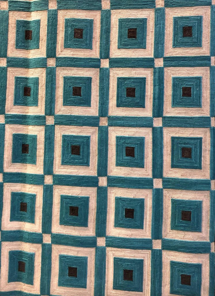
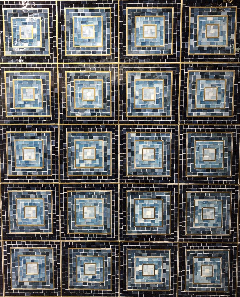
Touchable Textures
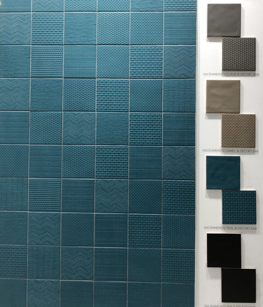
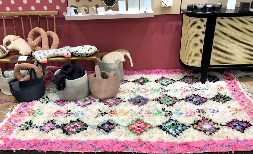
Perhaps tying in with the trend toward dramatic, rich spaces, so many elements at the show were begging for attendees to reach out and touch them. Fuzzy furniture, thick-knit rugs, and dimensional wall tile were prominently featured, bucking the trend of smooth, minimalist surfaces popularized by Scandinavian design.
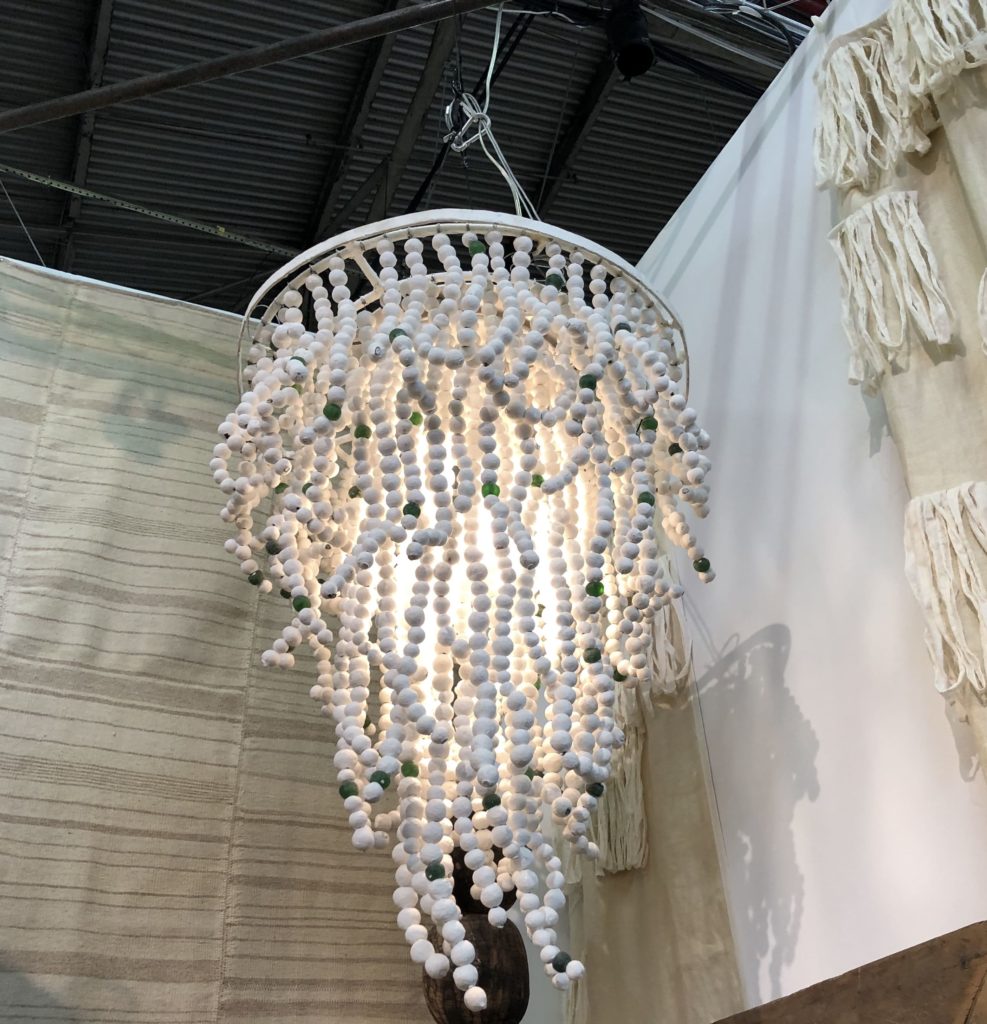
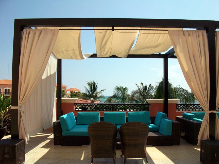
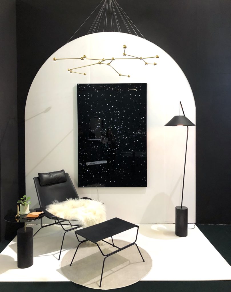
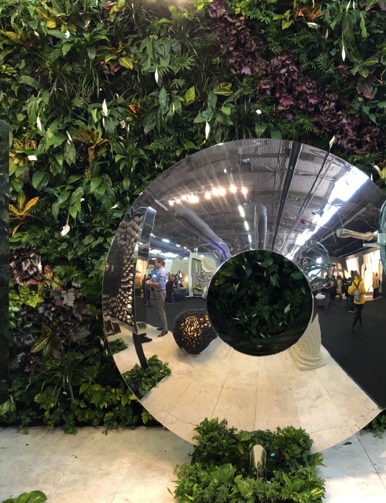
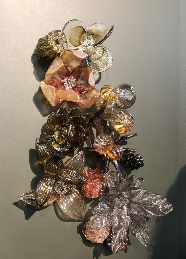
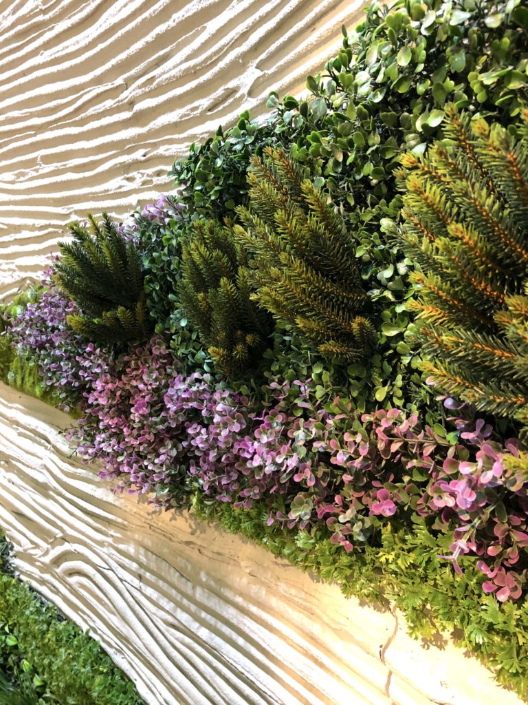
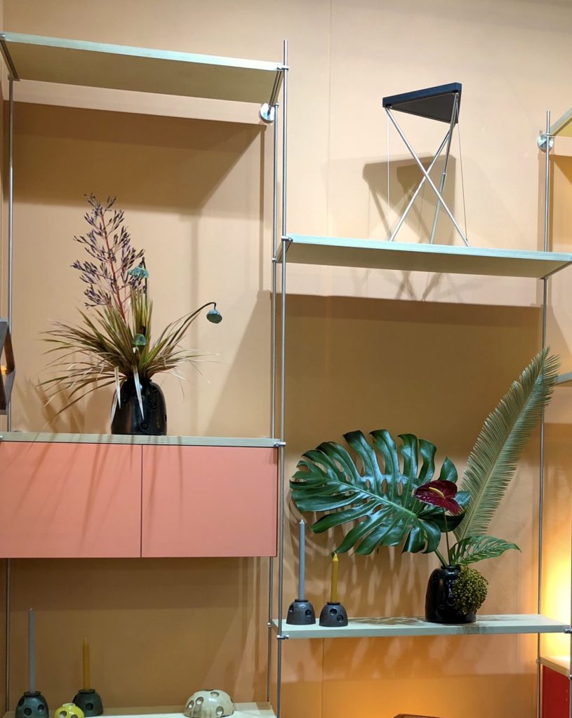
Outside In
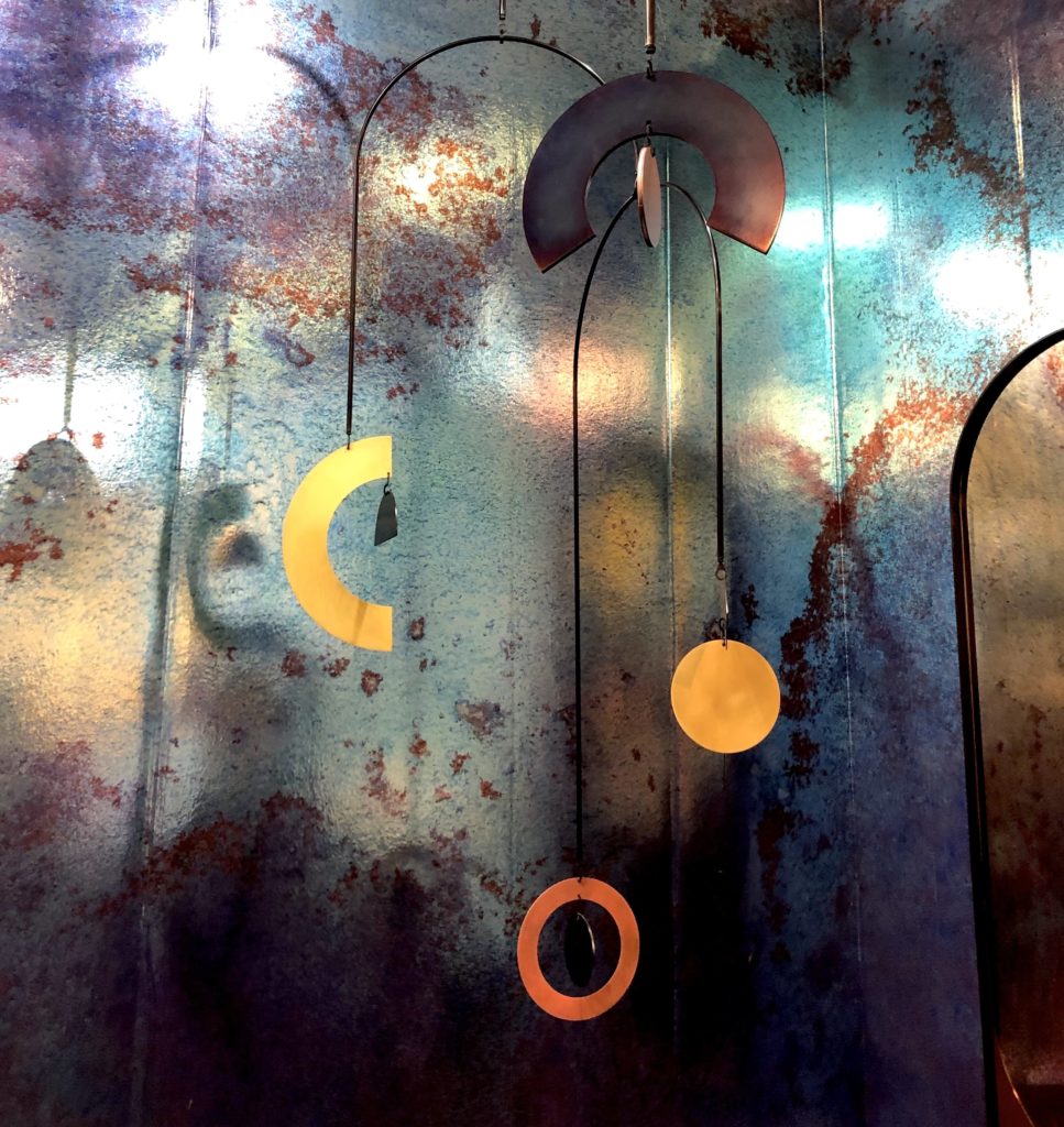
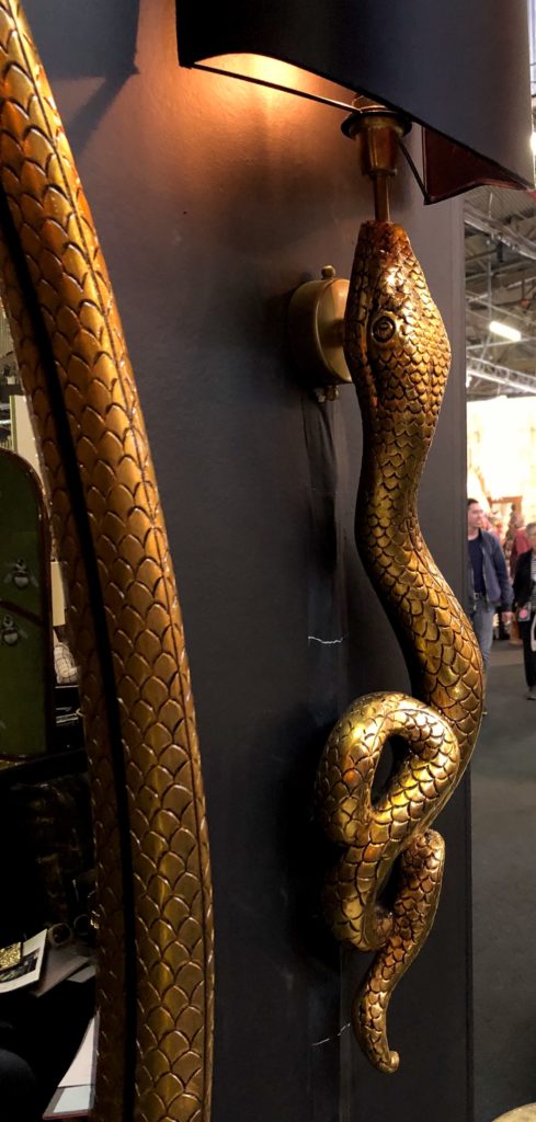
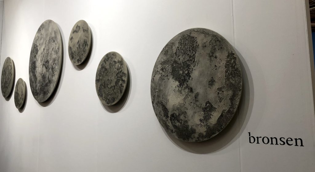
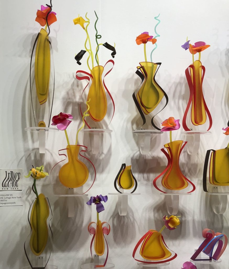
It’s been on-trend for awhile now to incorporate elements of nature into design. But at the AD Design Show, nature was center stage: lush greenery in the form of banana leaves, ivy and vines, succulents, and truly impressive plant walls were focal points of several booths. Other exhibitors incorporated florals into patterns and wall fixtures, especially in glass elements, or elements of wildlife into furniture accents. Some incorporated celestial elements such as starry lighting units, and even lunar furniture and wall hangings. As we spend more and more time inside – Americans spend approximately 90 percent of their time indoors, according to the EPA – it only makes sense that we would bring elements of nature and the outdoors into our homes.
Feeling Playful
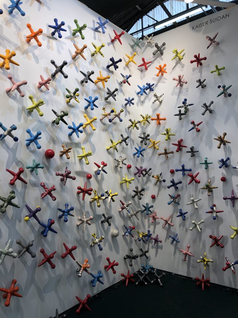
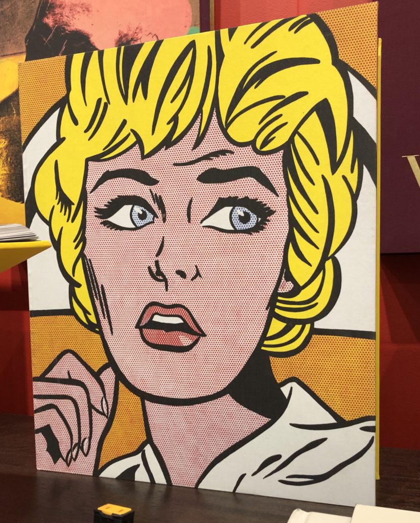
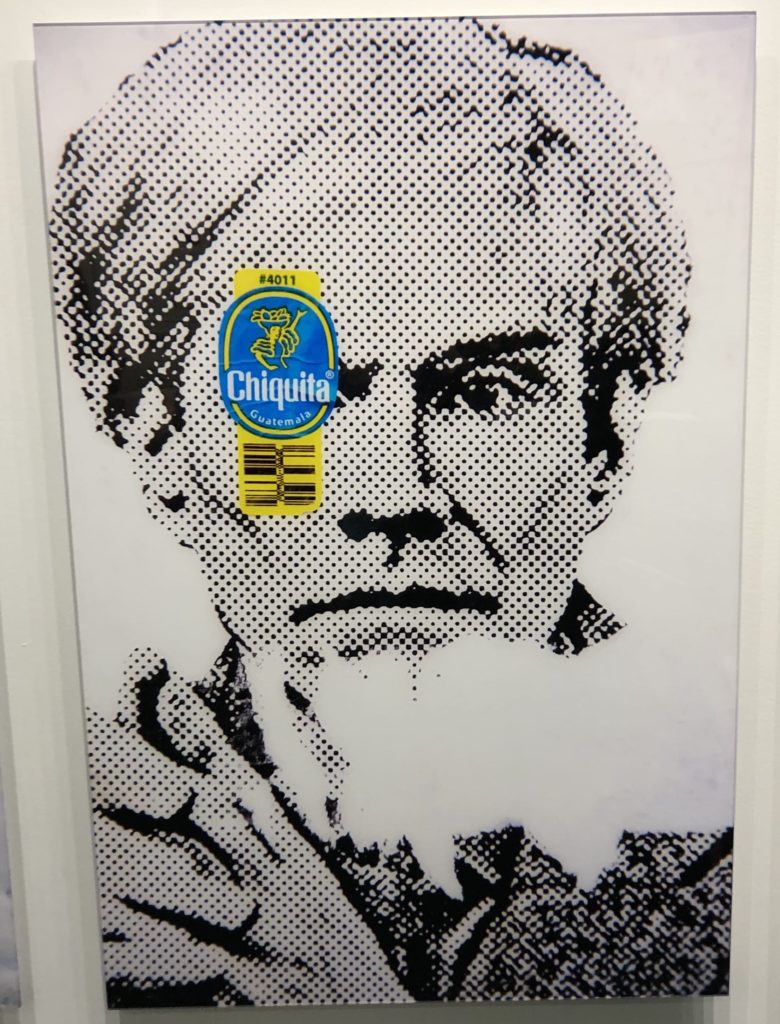
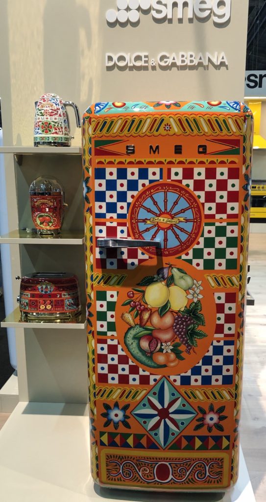
Pop art was the inspiration behind some of the booths on display, featuring bright, saturated primary colors and Warhol-inspired artwork. Other booths included fun color patterns and whimsical design elements. Maximalist designers played with mixing patterns and color schemes.
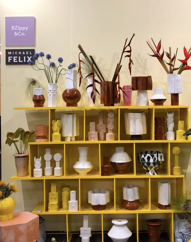
Warming Up
Neutrals are still key to any space, but we noticed that neutrals are skewing warm. Lots of color palettes and schemes were reminiscent of the American Southwest, pairing muted blues and sage greens with tans, beiges, and terra cottas. Lots of designers played on Pantone’s Color of the Year, Living Coral, offering a more matte-ified, toned-down shade that paired well with this warming trend.
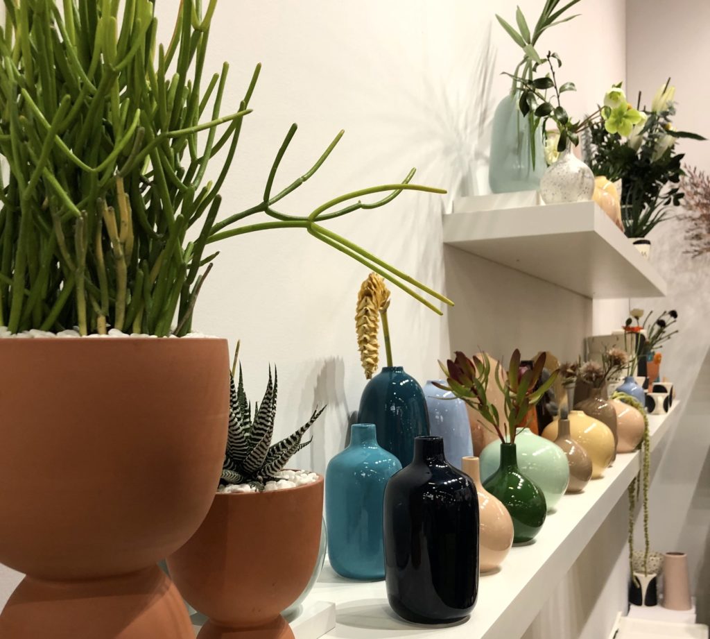
Color’s Comeback
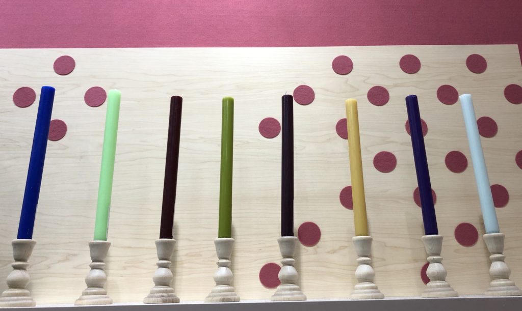
Gone are the days of monochromatic gray. While neutrals still hold an important place in every designer’s tool kit, we saw more and more color coming back into play. Popular picks among the booths included pinks of all shades and a range of blues that proved to be versatile.
About The Author

Lauren Moore
March 26, 2019
Proud flooring aficionado and office dog mom, "Flauren" has been a professional writer and editor for more than a decade (though she still maintains her magnum opus was "The Day it Snowed Slurpees," written at the age of 6).